New look for Budweiser
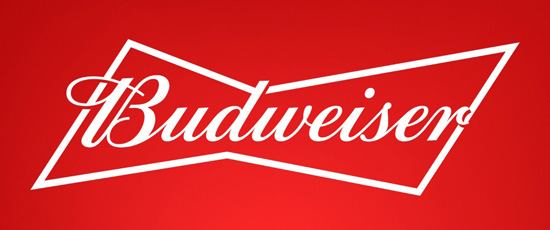
The self-styled 'King of Beers' has revealed a fresh new look for 2016. In comes a cleaner, simplified design with an updated 2D logo instead of the 3D version (a current trend which we featured on the Liv Design website in Autumn last year).

The new brand identity was designed by JKR in New York. The rebrand also features two bespoke fonts (typefaces) by Canadian lettering designer Ian Brignall: a chunky sans-serif font called Bud Bold and a serif font called Bud Crafted.

Out goes the crown icon and the gold colour. This gives a much more grown up and modern look.
The new colours reflect Budweiser's attempt to become more sophisticated without losing the brand's heritage with a corporate red, silver, white and blue colours. Evolution rather than revolution.


The intricate detail in the lock-up creates a bespoke, hand-crafted feel without focussing too much on the heritage. It's a much more forward facing approach. Large beer brands now have to compete with the rising growth of craft beers which Budweiser acknowledge in their latest ad which featured in the 2016 Super Bowl (with tongues firmly in their cheeks).

Comments
Post a Comment