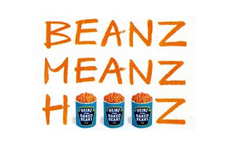
Happy 50th birthday, Helvetica
The Helvetica font is celebrating its 50th birthday.
One of the most influencial, widely used and mist recognized fonts celebrates it’s 50th birthday this year. Yes it’s conventional, yes some people hate it, and yes it has the loathed default cousin font Arial, but you have to admire a font that still looks modern today (particularly with the Neue family addition from the 1980s).
It’s such a clean, simple and organised font. It’s minimal. It says very little but speaks volumes. If a font was unbiased and civilized this would be it, the UN of fonts. It’s lack of novelty and cleanliness actually lends itself to being read, ironic really as it’s a sans-serif font (serif fonts like Times are supposedly easier on the eye to read).
It’s probably no coincidence then that it was created by the Swiss, Max Miedinger and Eduard Hoffmann in 1957 for the Haas Type Foundry in Switzerland.
The list of companies that have used the font is endless, including such household giants as Gap, Orange, Currys, Hoover, Lufthansa, Panasonic, Royal Bank of Scotland, Tupperware, and Zanussi…
Neville Brody, legendary graphic designer and typographer, sparked a spate of Helvetica use with his design for Arena magazine in the 80s (which incidentally has just been redesigned too), saying "When people choose Helvetica they want to fit in and look normal. They use Helvetica because they want to be a member of the efficiency club. They want to be a member of modernism. They want to be a member of no personality. It also says bland, unadventurous, unambitious.”
Love it or hate it, Helvetica is here to stay. After all, isn’t something that hasn’t aged, that has lasted 50 years and is still in use, now regarded as a classic?
And that in itself will encourage greater use. Happy Birthday…


Comments
Post a Comment